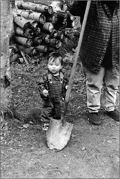
"Young Kid and Shovel"
Fairbanks, AK, 2000
-- Tony Rowlett (rowlett@alaska.net), June 30, 2000
Young Kid and Shovelgreenspun.com : LUSENET : People Photography : One Thread |

"Young Kid and Shovel"
Fairbanks, AK, 2000
-- Tony Rowlett (rowlett@alaska.net), June 30, 2000
"Young Kid and Shovel"
Fairbanks, AK, 2000I hate html. And filenames. And computers.
-- Tony Rowlett (rowlett@alaska.net), June 30, 2000.
This picture certainly illustrates "the child is father of the man". Very accomplished. More than anything, I find the tonality so appealing, gritty and creamy and the same time - I think that the unretouched picture is better in this respect. Tonality is an interesting thing - Jeff Spirer's "The Cook" had a very different feel - very creamy, like a souffle straight from the oven - which suited that picture equally well.Gosh, you guys are setting a very high standard. I need to get myself one of those scanner things ..........
-- fw (finneganswake@altavista.net), July 01, 2000.
I think this is my favorite picture of yours, and I think it's (mostly) because of your composition but I can't really tell because it's too damn big to fit on my monitor!I have two questions though... are you one of those poor guys who think they are forbidden to crop, a slave to the all seeing black line? I'd loose the fraction at top and right that leave unimportant little light spots whispering in my (visual) ear. while the overall tonal range is exquisite, I burn his little white shoe to a shade darker than his face and have a classic image when done. His expression is perfect, oblivious to you, but quite present in the moment. A really great shot, the shovel angle and the foreshadowing presence of his own possible future (played by the faceless adulthood looming at the right) and the implication of future duties (woodpile) combine to be an image full of the symbolism of a rural working life, close to the earth. Yet it is also a simple picture of a working man's son. Beautiful... t
-- tom meyer (twm@mindspring.com), June 30, 2000.
It is beautiful, and very gentle. It makes me think of a jock sturges photograph, but with clothes. To ride a tired horse it has that "je ne sais quois".Andy
-- Andy McLeod (andrewmcleod@usa.net), June 30, 2000.
Sometimes I am a slave to the full frame black line, and this may be one of those times. I did fiddle with cropping just a bit, but I liked the top, top left, and top right content areas so much that it would have looked awkward to remove only part of the bottom hence the 'aw heck, full frame it is' attitude. But I do understand your point and I do forego the original full frame on many of my shots but usually add a line to the final crop to separate the image both from a white background and a black one (w/a 1 pixel white border). Per my 'Beautiful Flaws' thread, I really love the uneven, slightly wobbly image edge that the full frame gives. I'd like to learn how some people do their borders, like Mike Dixon.
-- Tony Rowlett (rowlett@alaska.net), June 30, 2000.
I also like the photo, especially how the smallness of the child contrasts with the bigness of everything around him (yet he seems undaunted by it).The Pretentious Black Borders that I often use are made by printing full frame with a negative carrier that has the edges filed out so the opening is slightly larger than the image area of the negative. The oversize filing is not very precise--that's why the borders are irregular.
[The function of the Pretentious Black Border is to let people know that they are looking at Art. That way, they'll know that I'm an Artist and that any blurriness, poor focus, or odd composition is purely intentional. And that it's perfectly appropriate for me to be highly intoxicated while photographing. : ) ]
I try to print full frame unless there's a compelling reason not to, but I'll crop the hell out of things if I think it significantly improves the image. I'm more likely to crop when shooting medium format, often to turn the 645 into a square.
-- Mike Dixon (burmashave@compuserve.com), June 30, 2000.

"Young Kid and Shovel (revised)"
Digitally modified to correct shoe and bright spots per Tom's response. I agree that it looks much better. Thanks, Tom!
-- Tony Rowlett (rowlett@alaska.net), June 30, 2000.
Thanks, Tony. It's really a great shot. All the advice (or cropping and dodging) in the world won't make a bad shot good, you've got to have a solid image to start from. This one really works from any point of view... t
-- tom meyer (twm@mindspring.com), July 01, 2000.
Thanks, fw, but my shot is certainly not as accomplished as you somehow managing to get your July 1 post in between two June 30 posts! I've never seen that happen before in a greenspun forum.Interesting though about the retouched image. I took a little off the top, left, and right, and a little more off the bottom to remove some of the foreground. It may be the foreground in the original that added some strength to your perception of the image. After Tom brought the several bright whispers to my attention, they became obvious distractions to me, but not before Tom spoke. The biggest improvement for me was the boy's shoe. I didn't even see it, but it definitely competed with the much more important element in the image area -- the boy's face. I've learned from Uncle Ansel about sometimes darkening the surrounding areas of the print. This I did a little with the bottom part. As a side note, the original is a straight print, no dodge or burn!
-- Tony Rowlett (rowlett@alaska.net), July 02, 2000.